*Please see the associated Hacker News comments for some interesting discussion related to this article.*
I can recall in great detail the first time I learned about GnuCash. It was a sunny spring morning in Clear Creek Canyon, CO. My little white Prius, freshly dented by the previous week’s hail, was parked precariously on the thin strip of gravel separating the road from the steep, 30ft slope to the creek below. Looking down at it from beneath the rocky cliff band we were preparing to climb, it almost seemed poised to tumble into the rushing water at any moment.
But I wasn’t worried about that. I was too busy complaining about my troubles with tracking my personal finances. “Ledger’s simple plaintext interface was charming at first, but it’s getting a little tedious to input transactions like that. And I’m starting to want a more advanced GUI for plotting and generating reports,” I griped, stepping into my harness. My friends’ eyes glazed over as they nodded politely in agreement.
And that’s when it happened. That’s when the man belaying on the route next to us turned to me and said, “you should try GnuCash.” Though shrouded by the hood of his gray sweatshirt and his tinted wraparound sunglasses, his face was the face of someone who deeply cared about open source accounting software. And in that instant, my decision was made.
I would switch to GnuCash.
Today, dear reader, let me be your man in gray hoodie and wrap around sunglasses. I will help you take your first steps down the path to financial enlightenment.
Wait… What?
GnuCash is free, cross-platform, open source accounting software. I would like to explain to you how to use it to keep track of your personal finances, and in turn make better decisions about your spending and saving. You can also use its data to make cool graphs, like the one above.
Why You Should Care
Using GnuCash might interest you if:
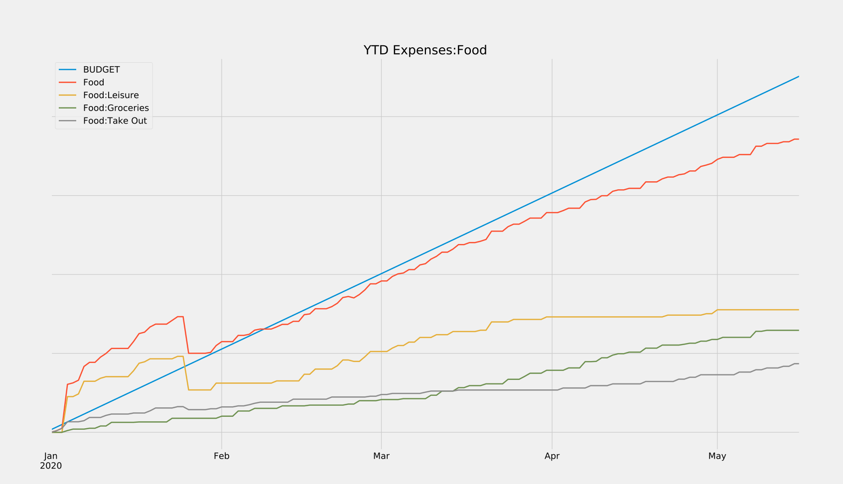
- You’ve ever wanted to quickly answer questions about your finances, like “how much of my income am I actually saving each month?” or, “how has this pandemic affected my spending habits?” In the graph above, notice when my spending on groceries overtakes my spending on takeout. It’s roughly on the date of the first stay-at-home order here in Washington. Cool, right? Those are the sorts of trends you can unearth with this data.
- You want to own all of your financial data. I know there are some online offerings out there that promise to automagically handle the tedious parts of using GnuCash, and I would encourage you to research those as well. I choose not to use any of them because I would like to have access to my data indefinitely. I don’t want that access to hinge on a company staying in business for the rest of my life, or having the goodwill to let me download it in a future-proof file format. Because GnuCash is open source and already has good cross-platform support, I feel comfortable trusting that it (or a free replacement) will still be around in N years.
- You want to promote good financial habits. Most of the value I get from using GnuCash comes from being forced to think about every single transaction I make. Stupid purchases have a lot more weight when you can see their impact on your finances as a whole. Also, by forcing yourself to log and verify all of your transactions, you’ll be much more likely to catch fraudulent activity on your accounts early before they can cause damage.
Why You Should Maybe not Care
GnuCash might not be for you if:
- A time investment of 2-4 hours a month is too much for you. Those numbers could be higher or lower depending on the complexity of your personal financial situation, but that’s roughly the amount of time I spend.
- You wouldn’t benefit from having more granular financial data. If you’re happy with just knowing that your credit card balance is less than a certain amount each month, that’s great! You don’t need GnuCash. If, however, you want to know why your credit card balance is a certain amount each month, you might want to read the rest of this post.
The Payoff
Finance people care about returns. So in the spirit of doing finance-y stuff, I figured I’d showcase the sorts of returns you can expect from investing your time into GnuCash. Just a heads-up, all of these graphs have had the dollar values redacted (because it’s my real data), but rest assured that these would show actual amounts if you were to generate them yourself.
Lets’s start with some examples from GnuCash’s built-in suite of customizable reports and graphs:
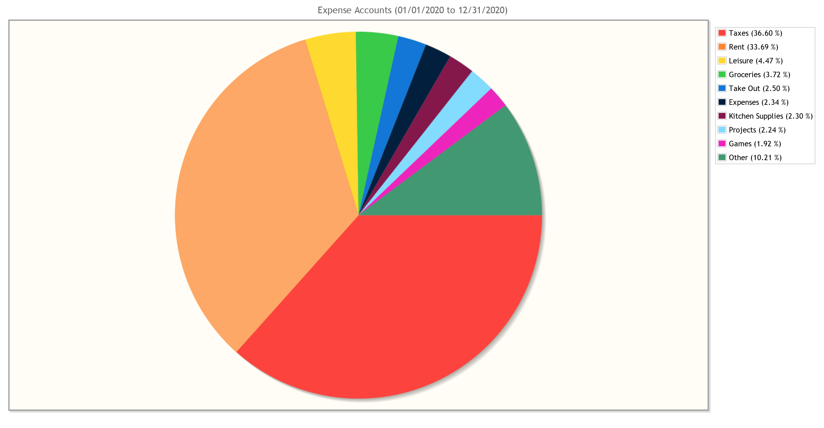
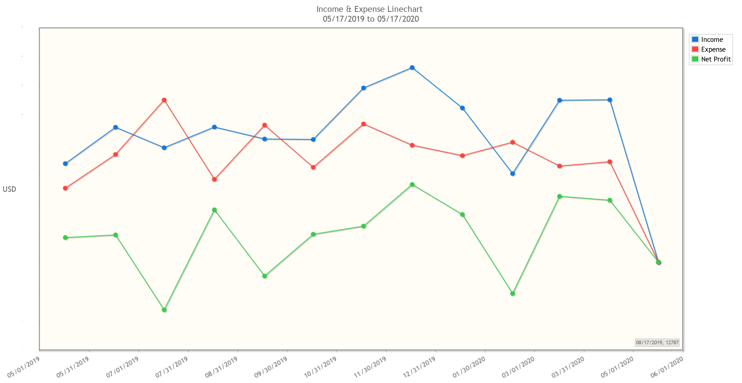
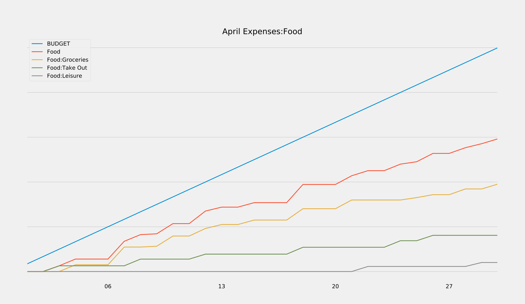
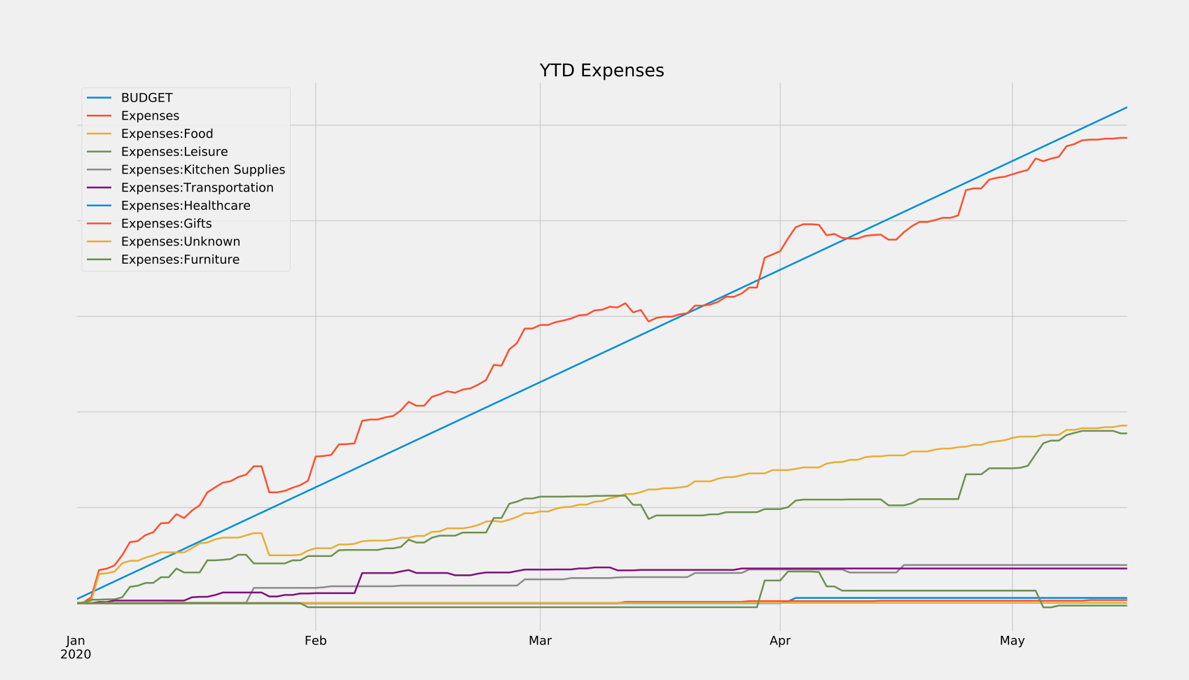
These can reveal all sorts of trends at a glance, which can then be dug into using robust search functionalities built into the program. And if the built-in search and reports don’t have the functionality you need, that’s ok! We own all of our data, and can choose to save it in a variety of friendly formats (XML, SQLite, etc.) If there’s something you want to see calculated or plotted, you can always use a package like piecash to query against your data and generate custom plots. That’s what I did in order to generate the reports below, which show me in real-time how close I am to meeting my monthly and yearly budgets. I’ve also released these scripts here so you can use them for your own GnuCash purposes.
How Money Flows: GnuCash Key Concepts
At the highest level, you can think of GnuCash as a place to keep track of a set of accounts, where each account represents a source of money. For the most part, each real-world money account you own will be tracked by its own GnuCash account. Your checking account, 401k, credit card, and Venmo would all be individual accounts in GnuCash. However, not every GnuCash account necessarily represents a single real-world money account, as we’ll address later.
In order to keep the values in these accounts up to date, we create transactions. Each transaction has an associated date, description, and amount. Every time something happens that changes the amount of money that you have, you record it in GnuCash as one of these transactions. For example, if you were to go to a bakery and buy a cake, you would create a corresponding transaction in your credit card GnuCash account - like this:
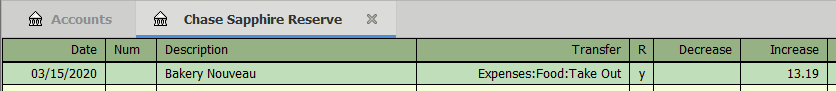
This should be a very familiar sight, as it’s nearly identical to how your bank or credit card display things on your statement. When a $13.19 transaction is added to your credit card statement, your total balance increases by $13.19. The exact same thing happens here. However, there is one major difference that you need to understand:
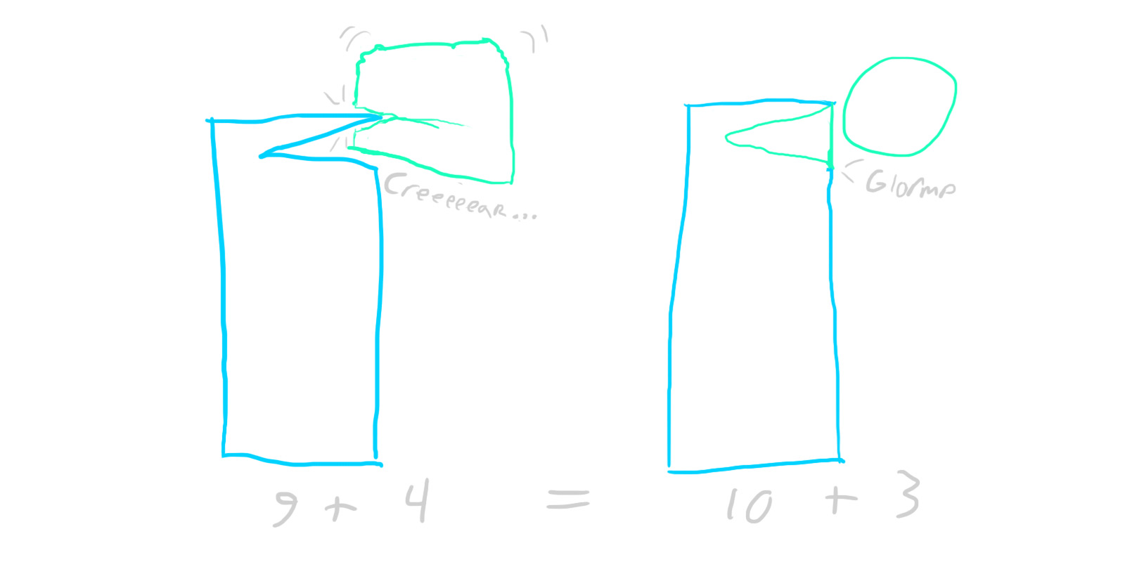
In GnuCash, money is never created - only transferred.
That may sound very abstract and zen proverbe-esque, but it’s at the heart of what makes GnuCash so powerful, and is the most important thing to understand when using GnuCash.
We can see this principle in action in my bakery example. Take a look at the “Transfer” column: it shows that the $13.19 we’re adding to our credit card bill is not appearing out of thin air, but is instead being transferred from an account named “Expenses:Food:Take Out”. If you think about it, this is exactly what happens in the real world, too. That $13.19 on your credit card statement doesn’t just appear out of thin air. Behind the scenes, the credit card company is paying the bakery $13.19 (sans fees) and then taking that $13.19 from you. The money wasn’t created, it was transferred from your credit card balance to the bakery’s bank account.
This simple but powerful concept is called double-entry bookkeeping, and its purpose is twofold. First and foremost, it protects you from making accounting errors. There’s no way to record a $1000 payment for rent, and then accidentally forget a zero and only deduct $100 from your bank account. By definition, every single dollar needs to come from somewhere, so GnuCash will notice $900 that are unaccounted for and will complain. A state of balance is strictly enforced. Secondly, this system automatically categorizes every transaction you make. Every time we earn or spend money, we by definition know where it came from and where it went. This makes things a whole lot easier when trying to generate reports later down the line.
Notice, however, that GnuCash is transferring money to an account called “Expenses:Food:Take Out”, not “Bakery Bank Account”. So what gives? Well, while it is entirely possible to make a new virtual account for every real-world money account that we interact with, it just doesn’t benefit us to do so. From a budgeting standpoint, we don’t care how much we spend at Whole Foods vs Trader Joe’s, we just care about how much we’ve spent on groceries in general - so we can throw all of those transactions in an “Expenses:Food:Groceries” account (GnuCash uses colons to denote nested accounts, so this is really the “Groceries” child account of a “Food” account in the “Expenses” grandparent account.)
The same goes for other things as well. We don’t care about how much money we’ve spent at Amazon, we care about what we’ve spent our money on when we’ve shopped at Amazon. Bought a desk? Charge it to the “Expenses:Furniture” account. A whisk? That goes in “Expenses:Kitchen Supplies”. Not specific enough for you? Create an “Expenses:Furniture:Office” account, or an “Expenses:Kitchen Supplies:Metallic” account. Too much work? Just throw those transactions into the root “Expenses” account and be done with it. With GnuCash, you are completely in control of how you organize your transactions. How you choose to do this will affect the level of granularity you can achieve in your reports and plots, but it’s otherwise all the same to GnuCash. All that GnuCash cares about is whether or not the transactions are balanced - when money enters one account, the same amount of money must leave from another.
Getting Started with GnuCash
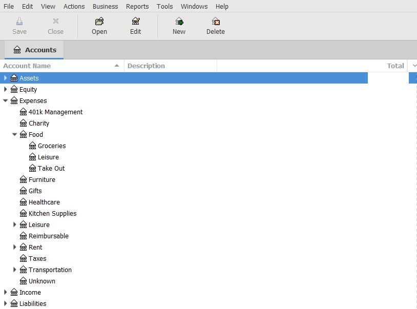
When you first start up GnuCash, it will pop up a little setup wizard that forces you to create some accounts. As alluded to above, you can choose to organize your accounts however you like. With that being said, there are five top-level accounts that GnuCash will automatically create, and all other accounts you create will likely fall under these top-level accounts (as can be seen in my accounts page above). These accounts are as follows:
- Assets are things you actually own, like checking accounts, brokerage accounts, 401ks, Venmo account, cash in your wallet, etc.
- Equity is described by the GnuCash docs as “overall net worth”, but I’ve always been iffy on how that differs from Assets for my use case. As such, I mostly choose not to use it. It may serve a purpose if you’re doing some more advanced accounting or using certain built-in reports.
- Expenses are destinations for money that you spend, like groceries, rent, taxes, etc.
- Income accounts are sources of money that you receive, like salary from an employer, gifts, etc.
- Liabilities are things you owe - money that you’re going to have to pay eventually, but haven’t yet. Personally, I only use this as the parent account for my credit cards, but you could track things like personal debts or loans here as well.
It is important to create these specific accounts because GnuCash treats transactions between them differently based on their account types. For example, a positive balance in a “Liabilities:” account indicates that you own a negative amount of money whereas a positive balance in an “Assets:” account indicates a positive amount. Similarly, some of the GnuCash built-in reports rely on having the right account types set as well.
Once you make it through the setup wizard, take a look through some of the default accounts that GnuCash has created for you. Feel free to delete the ones you won’t use, and create new ones that you will. When you’re done with that, you’ll have a bunch of accounts - all with a balance of $0. Obviously, most of your real-world money accounts have some non-zero amount of money in them, so our final step in the setup process is to change the GnuCash ones to reflect that. As we know by now, we can’t just create this money - it needs to be transferred from somewhere. GnuCash helpfully gives us a premade “Equity:Opening Balances” account to use just for this purpose.
Let’s say we’ve just created an empty account named “Assets:Checking Account”, and we want to set it up so that it reflects the balance of our real-world checking account, which has $1000 in it. To do this, we’d fill out a new transaction entry with the current date, a description of “Opening Balance”, a transfer account of “Equity:Opening Balances”, and a Deposit of $1000. When we enter that transaction, our account page will update to reflect our new balance of $1000.
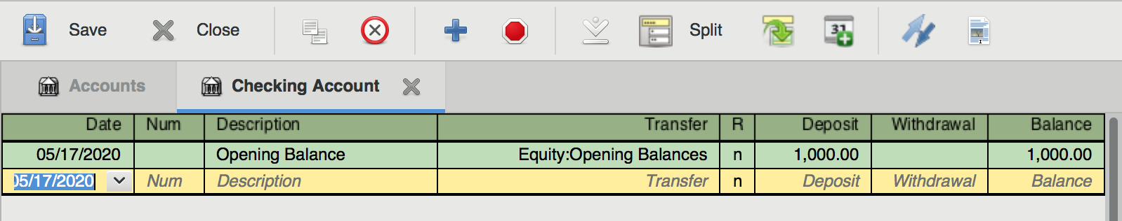
Now, if you open up the “Equity:Opening Balances” account, you’ll actually be able to see and edit the transaction there as well. This is GnuCash’s golden rule in action. To get the $1000 into your bank account, it needed to leave the opening balances account. As such, both accounts will display the transaction.
Logging Your Transactions
If you’re quick, you can finish this initial setup in less than 10 minutes. Congrats! You’re on your way to a wealth of rich financial data.
Now comes the hard part: remembering to actually log all of your transactions.
In order to maintain a state of balance, you’re going to record every single transaction you make - which sounds scary, but only takes me around 2-4 hours a month split across two sessions. If you’re more disciplined than I am, you can do your logging incrementally instead of all at once. I haven’t tried that, but I’d bet it could cut the total time invested down to around an hour or so per month.
Being successful at logging your data all starts with having a good workflow for collecting the data (receipts, invoices, etc.) In practice, I handle three separate cases here:
- In the ideal case, I log purchases in the GnuCash mobile app. So, as soon as I pay the bill at a bar/restaurant/store, I’ll immediately pull out my phone and log the transaction. The app support both Android and iOS, and you can import your account structure from desktop so that autocomplete works.
- Sometimes I forget to use the mobile app, so for restaurants that support email receipts (and online purchases), I prefer those over paper receipts. The next time I check my email, I immediately move any receipts to a receipts folder to get them out of my inbox (I practice inbox zero).
- Paper receipts are the worst-case, but many places are still paper-only. These suck because they’re easy to lose. I recommend buying a little receipt spike off of Amazon for $6, and sticking any amassed paper receipts on it as soon as you get home (which has the added benefit of keeping them in chronological order).
Next comes the actual data entry. The first step here is to import any transactions logged from GnuCash mobile. The app has a nice feature where it remembers the last time you exported, and then will only dump new transactions to any number of file formats, which can then be ingested by the desktop version of the app. Once this is done, it’s just a matter of hammering away at entering all the receipts you’ve saved. If you remember the steps we went through for setting our opening balances, that’s essentially all you need to do for each receipt - just changing the date, description, amount, and transfer account for each one. This might sound terrible, but it’s very easy once you get into the habit. Honestly, it can be super relaxing at times. I tend to do my logging first thing on a Sunday morning - just throw a soccer game or some mindless YouTube on the second monitor and enter cruise control for a little.
Now, there’s a potential (large) shortcut here. Instead of saving and entering all of your receipts manually, you could just export all of your credit card/bank account transactions from your bank website, then import them into GnuCash. There are a few reasons why I don’t personally do this, though. First of all, going through each transaction manually forces me to think about how I’m spending, which is really (IMO) the whole point of using GnuCash as an individual. Secondly, I manually log my transactions because I want more granularity than the categories that my credit card company auto-assigns to each transaction (though you could always just edit these after import). Finally, auto-importing transactions from another source is also going to auto-import any potentially fraudulent charges that might be in there. Of course, you could (should) go through each one of the imported transactions and look for suspicious ones, but I feel like I’d personally be more likely to miss something that way than if I were to manually enter everything I have receipts for and then inspect any discrepancies. Maybe that’s just me. Regardless, these are things to consider. For what it’s worth, I imagine it would save a ton of time to do this sort of import workflow. Especially when it comes to reconciling your accounts.
One important thing to consider - some transactions might involve from more than two accounts. For example, some of your paycheck goes to taxes, some to your 401k, some to your bank account, etc. Instead of creating separate transactions for each of these, we can create a single split transaction that groups all of them together. Don’t forget that the golden rule of GnuCash still applies here - even split transactions need to be fully balanced. We’re just balancing them across multiple accounts. So, for example, if your employer pays you $1000 and $300 goes to taxes, exactly $700 must go to your bank account, or be further divided among other accounts (so long as their values sum to exactly $700).
Speaking of paychecks (or rent, or other things that happen periodically), you can save time by using scheduled transactions. This feature just automatically creates templated transactions at set dates, and is really handy for anything that happens on a schedule.
Reconciliation
Ok. Now that we’re done entering all of our data, it’s time to reconcile our accounts - basically just making sure that there’s a 1:1 mapping of transactions in our GnuCash file to transactions in our real-world accounts. You don’t have to do this for every account, or even at all if you don’t want to. A delta of a few bucks between your real-world and GnuCash accounts probably isn’t a big deal. However, if you’re off by a little bit every time you log, that couple bucks difference can quickly grow into much, much more. And trying to find a mistake in your accounting over a >1 month period is a pain in the ass. Trust me. If you’re going to do it at all, it’s a whole lot easier to reconcile incrementally instead of all at once.
To reconcile an account, start by opening up both the reconciliation window (Actions->Reconcile) and whatever corresponding documentation you have for the real-world account. In this case, let’s pretend we’re looking at an online credit card statement.
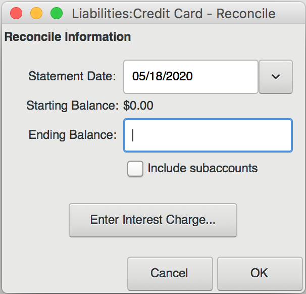
This is what it looks like when you open the reconciliation window. In the “Ending Balance” field, you should put the most recent balance displayed on your credit card statement. Then, go through each transaction on the statement and find the corresponding transaction in the reconciliation list. Click the checkbox next to that transaction. As you check each transaction, you’ll see the “Difference” field in the bottom right of the window change value. Your goal is to get this field to zero out, indicating that there’s no difference between virtual and real-world accounts.
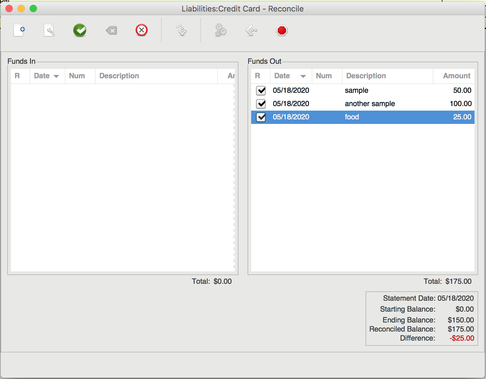
If you get to the end and see a non-zero difference, you should have either a) encountered a transaction that was present in your real account but not your virtual one, or b) vice versa. In the case of a), make sure that you recognize the charge, then add a matching virtual transaction. I often find that case b) only happens when a transaction has not been processed by my bank yet. In the picture above, notice how our virtual account exceeds our real one by $25. I would bet that the $25 charge for “food” just hasn’t posted to the credit card statement yet. In that case, just uncheck it. It will show up next time you enter the reconciliation dialog, whereas the other, fully reconciled charges will not.
Dealing with Different Types of Assets
If you own stocks or assets in different currencies, GnuCash has tools to help you out, but your accounting will become a little harder. I don’t personally mess with any of this functionality, so I can’t help you out unfortunately. The GnuCash docs are pretty decent though, if a bit dense and scary looking.
For my stocks and non-money assets, I opt not to track them super closely in order to avoid having to update the values of each stock every time. So, I have one “Assets:Brokerage:Stocks” account that tracks the rough value of all of my holdings in USD. Whenever I log transactions, I go in and adjust that real money value of my entire portfolio with a single transaction from an “Income:Stock Value” or “Income:Interest and Dividends” account. This has served me well enough, but your mileage may vary.
Hooray! We’re Done!
And that’s it! You now have an up-to-date, categorized record of all of your financial transactions. Take this time to reflect on your spending, make an informed budget, look at nice graphs, etc. Or don’t! You own the data, so you can be sure it’s not going anywhere, just don’t forget to back up all of your files (I keep it under version control).
Hope this helped!
]]>


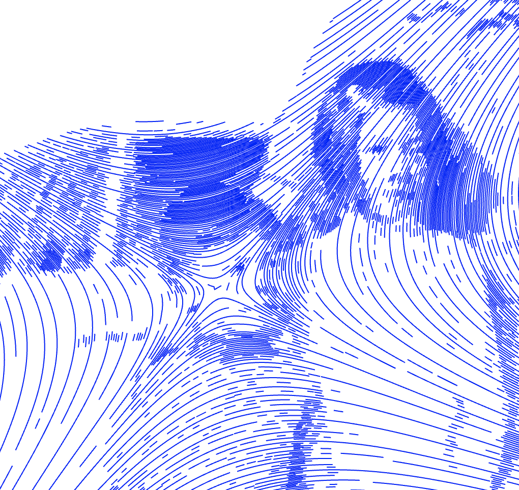
 A portrait of my dad, aunt, and grandfather. The piece is a heavily processed and vectorized version of an old photo of the three of them, plotted on watercolor paper.
 A closeup of some of the texture generated by the pen plotter. Plotting gives a lot of subtle variation that you don’t get from normal printers.